
css2014-08-12 07:46:17 5168
显示一个自己刚写的CSS3的柜子,不支持IE哈。可以用chrome,Firefox和Safari浏览器查看演示。
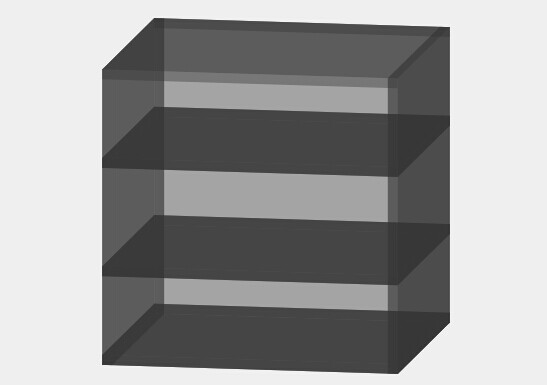
拆分后:
 源代码:
源代码:
.cubicItem {
	width: 300px;
	height: 300px;
	position: absolute;
	text-align: center;
	line-height: 300px;
	font-size: 50px;
	font-weight: bold;
	color: #333;
	background-color: #ccc;
	transition-duration: 2s;
}
.cubicItem:nth-child(1) {
	-webkit-transform: translateZ(150px);
	transform: translateZ(150px);
	-moz-transform: translateZ(150px);
	-ms-transform: translateZ(150px);
	-o-transform: translateZ(150px);
	display: none;
}
.cubicItem:nth-child(2) {
	-webkit-transform: rotateX(180deg);
	transform: rotateX(180deg);
	-moz-transform: rotateX(180deg);
	-ms-transform: rotateX(180deg);
	-o-transform: rotateX(180deg);
	-webkit-transform: translateZ(-150px);
	transform: translateZ(-150px);
	-moz-transform: translateZ(-150px);
	-ms-transform: translateZ(-150px);
	-o-transform: translateZ(-150px);
}
.cubicItem:nth-child(3) {
	-webkit-transform: rotateY(270deg) translateZ(150px);
	transform: rotateY(270deg) translateZ(150px);
	-moz-transform: rotateY(270deg) translateZ(150px);
	-ms-transform: rotateY(270deg) translateZ(150px);
	-o-transform: rotateY(270deg) translateZ(150px);
}
.cubicItem:nth-child(4) {
	-webkit-transform: rotateY(90deg) translateZ(150px);
	transform: rotateY(90deg) translateZ(150px);
	-moz-transform: rotateY(90deg) translateZ(150px);
	-ms-transform: rotateY(90deg) translateZ(150px);
	-o-transform: rotateY(90deg) translateZ(150px);
}
.cubicItem:nth-child(5) {
	-webkit-transform: rotateX(90deg) translateZ(150px);
	transform: rotateX(90deg) translateZ(150px);
	-moz-transform: rotateY(90deg) translateZ(150px);
	-ms-transform: rotateY(90deg) translateZ(150px);
	-o-transform: rotateY(90deg) translateZ(150px);
}
.cubicItem:nth-child(6) {
	-webkit-transform: rotateX(270deg) translateZ(150px);
	transform: rotateX(270deg) translateZ(150px);
	-moz-transform: rotateX(270deg) translateZ(150px);
	-ms-transform: rotateX(270deg) translateZ(150px);
	-o-transform: rotateX(270deg) translateZ(150px);
}
.cubicItemChildItem {
	width: 300px;
	height: 10px;
	position: absolute;
	text-align: center;
	line-height: 300px;
	font-size: 50px;
	font-weight: bold;
	color: #333;
	background-color: #ccc;
	transition-duration: 2s;
}
.cubicItemChild {
	width: 300px;
	height: 10px;
	float: left;
	transition-duration: 2s;
	-webkit-transform-style: preserve-3d;
	/*-webkit-transform: rotateX(-10deg) rotateY(-10deg);
	transform: rotateX(-10deg) rotateY(-10deg);*/
	transform-style: preserve-3d;
	margin-top: 0px;
}
.cubicItemChildItem:nth-child(1) {
	-webkit-transform: translateZ(150px);
}
.cubicItemChildItem:nth-child(2) {
	-webkit-transform: rotateX(180deg);
	-webkit-transform: translateZ(-150px);
}
.cubicItemChildItem:nth-child(3) {
	width: 300px;
	height: 300px;
	-webkit-transform: rotateX(90deg) translateZ(150px);
}
.cubicItemChildItem:nth-child(4) {
	width: 300px;
	height: 300px;
	-webkit-transform: rotateX(90deg) translateZ(140px);
}
.cubicItemChildItem:nth-child(5) {
	width: 300px;
	height: 10px;
	-webkit-transform: rotateY(90deg) translateZ(-150px);
}
.cubicItemChildItem:nth-child(6) {
	width: 300px;
	height: 10px;
	-webkit-transform: rotateY(90deg) translateZ(150px);
}
.cubicItemChild2 {
	margin-top: 280px;
}
.cubicItemChild3 {
	-webkit-transform: rotateY(90deg) rotateX(90deg) translateZ(155px);
	margin-left: -145px;
}
.cubicItemChild4 {
	-webkit-transform: rotateY(90deg) rotateX(90deg) translateZ(165px);
	margin-left: 145px;
}
.cubicItemChild5 {
	margin-top: -230px;
}
.cubicItemChild6 {
	margin-top: -120px;
}
.bgColor {
	opacity: .4;
	background-color: #333;
}
.insert {
	opacity: .6;
	background-color: #333;
}
.cubicItemChild4:hover {
	margin-left: 200px;
}
.cubicItemChild5:hover {
	-webkit-transform: translateZ(165px);
}
.cubicItemChild6:hover {
	-webkit-transform: translateZ(165px);
}
.cubicItemChild3:hover {
	margin-left: -200px;
}
.cubicItemChild2:hover {
	-webkit-transform: translateZ(165px);
}
彭亚欧个人博客原创文章,转载请注明出处
文章关键词:CSS3立方体,CSS33D效果,CSS3柜子
文章固定链接:https://www.pengyaou.com/legendsz/front/codecss/NTg=.html
下一篇 Jq扇形,圆形菜单插件